The 9/11 Falling Man – Another Look
Posted by vonnagy on Jul 03 2009, in 911, Falling Man, Photo, zegarkus
originally post was located here http://zegarkus.com/2006/12/07/the-911-falling-man-another-look/
This my reflection one of the most powerful photographs of this century – ‘The Falling Man’ by Richard Drew. If you want know the background of this photo – please see the movie 9/11 The Falling Man. It is gripping story of the power of a single photograph. While most will talk about personal story about the photograph, I will attempt to discuss some of the elements that make this photo especially powerful.
The Crop:
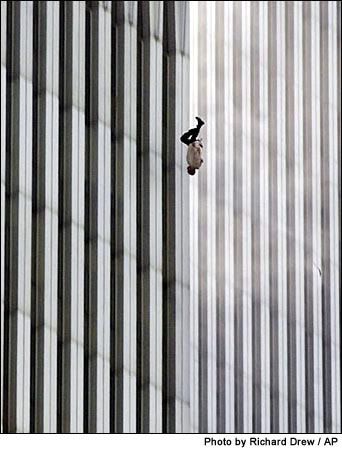
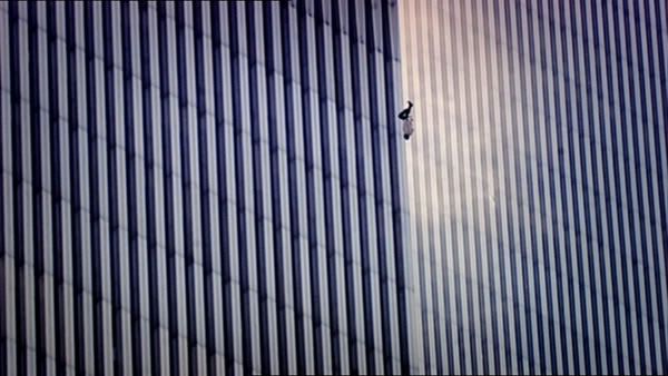
This photograph – was published in a completely different crop from the originally version: here are both versions:
Vertical Crop as released by the press:

Horizontal Crop as originally taken:

Note that horizontal crop – is not available yet doing google searches. I took this screenshot from the DVD.
As you can see, just buy changing the crop dramatically change scope the picture. The vertical crop zooms in the subject – it at once becomes more personal. Here are few thoughts about the vertical crop that come into mind.
- Its personal – we can almost make out who the person is
- Centered- the man is nearly centered in the focus (off by a few pixels) – making the man an obvious focal point.
- Divided: The dark left panel and lighter right panel vertically split the image in half -giving it more impact and something that follows the more traditional rule of thirds (though the man is in the upper third). The two opposing colours come to head close to where the man is falling.
- Action – the black and white lines denote a strong sense of vertical movement.
- The vertical shot – from printing point of view, vertical shots can fit into traditional magazine, newspapers and books better. Though I don’t think was the issue for cropping the photo this way, its certainly a fact to be considered.
The horizontal crop conveys a completely feeling:
- It is more removed and abstract – here the elements of the photograph lead to the falling man – it doesn’t have the ‘gut impact’ of the vertical crop, but its impact is much more subtle. I’ll go as far as saying that this photo would have dramatically less reaction if it was released instead. But do not mistake less reaction with less powerful here. In many respects, I think this portrayal is more power as discussed further below.
- Uncentered – Though the man is central – it is not as centered as the vertically crop. Here the focus is on the entire scene – not just the falling man.
- Suspension – where the above crop had strong vertical lines denoting movement, notice the semi-circle lighting to the right. There is more ’space’ around the falling man in horizontal shot to give it a sense of floating.
By cropping the image vertically – you increase the impact of the photograph. You bring immediacy to the subject matter. You punch the viewer in the proverbial gut. The original shot in a certain sense is more holistic. Here you have man who was probably around 180cm tall pitted against the backdrop of a massive tower which was approximately 415 metres high. What lose in immediacy you gain in perspective.
Lines
The ‘lines’ of the two crops are completely different and each powerful in their own way. The vertical lines give a sense of falling, but an even stronger aspect are the vertical lines. Notice in both crops there diagonal line that points directly to the head of the falling man.
The horizontal version has something the vertical crop doesn’t – curved lines. In the shot, there is almost half a spot light on the falling man. You can visualise this as a semi circle. These contrast to the straight vertical lines. This ’spot light’ softens the falling effect in my view and gives it more a floating, surreal feeling. It allows the eyes to meander over the entire photograph – taking in not just the falling man, but the entire building and the entire event that took place.
Final thoughts…
This is photograph by no means is easy subject matter. Like Eddie Adams or Frank Capra (in)famous war time images it provokes a multitude of different feelings. What struck me is how something as simple cropping the image elicited different emotions for me. Regardless of the crop – it is a timeless harrowing photo that is not easily forgotten.
The Posture
The posture of the man is at once graceful. In actuality a series of the shots indicate that he had a twisted and contorted fall – yet in the photograph it looks almost blissful. The Photo was taken, as the famous French Henri Cartier-Bresson would have said, at the ‘Decisive Moment‘.
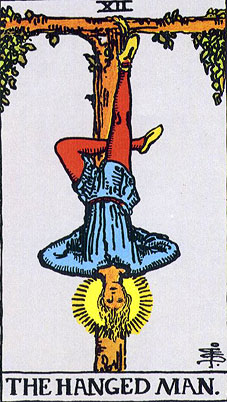
Personally, two archetypes come to mind when I look at the posture – the idea of superman diving from building and also the more obscure ‘hanged man’ tarot. Each of these images has powerful and possibly subliminal meanings.
